Quantitative data is information about quantities; that is, information that can be measured and written down with numbers. Some other aspects to consider about quantitative data:
Bar Graph
A diagram in which the numerical values of variables are represented by the height or length of lines or rectangles of equal width.

Histogram
A diagram consisting of rectangles whose area is proportional to the frequency of a variable and whose width is equal to the class interval.

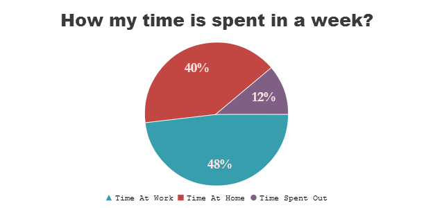
Pie Chart
A type of graph in which a circle is divided into sectors that each represent a proportion of the whole.
Scatter Plot
A scatter plot is a graph in which the values of two variables are plotted along two axes, the pattern of the resulting points revealing any correlation present.

Qualitative data is information about qualities; information that can't actually be measured. Some other aspects to consider about qualitative data:
Word Clouds
A word cloud is an image composed of words used in a particular text or subject, in which the size of each word indicates its frequency or importance.

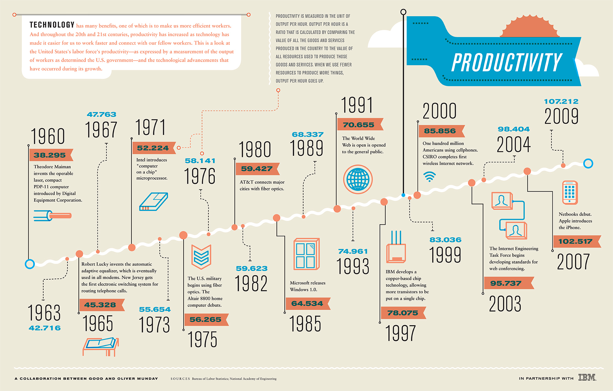
Graphic Timelines
A timeline is a type of chart which visually shows a series of events in chronological order over a linear timescale. The power of a timeline is that it is graphical, which makes it easy to understand critical milestones, such as the progress of a project schedule.